Note: This is part 4 in a series for high school students about reading and interpreting science on the internet. Read the intro and get the index here, or go back to part 3 here.
When last we met, we covered what I referred to as “narrative pictures”, or pictures that were being used to add to the narrative part of the story. In this section, we’re going to start looking at pictures where the problems are more technical in nature…ie graphs and sizing. This is really a blend of a picture problem and a proof problem, because these deceptions are using numbers not narratives. Since most of these issues are a problem of scales or size, I’m calling this section:
Graphs: Changing the View
Okay, so what’s the problem here?
The problem, once again, is a little bit of marketing. Have you ever judged the quality of a company based on how slick their website looks? Or judged a book by it’s cover, to coin a phrase? Well, it turns out we’re very similar when it comes to judging science. In a 2014 study, researchers gave people two articles on the effectiveness of a made up drug. The text of both articles was the same, but one had a graph that showed the number of people the drug helped, the other did not. Surprisingly, 97% of the people who saw the graph believed the drug worked, whereas only 68% of people who read the text did. The researchers did a couple of other experiments, and basically found that not just graphs, but ANY “science-ish” pictures (chemical formulas, etc) influenced what people thought of the results.
So basically, adding graphs or other “technical” pictures to things to lend credibility to their articles or infographic, and you need to watch out.
Okay, so what kind of things should we be looking out for?
Well, in many cases, this isn’t a really a problem. Graphs or charts that reiterate the point of the article are not necessarily bad, but they will influence your perception. If the data warrants it, a chart reiterating the point is fantastic. It’s how nearly every scientific paper written operates, and it’s not inherently deceptive….but you may want to be aware that these pictures by themselves will influence your perception of the data. Not necessarily a problem, but good to be aware of under any circumstance.
There are some case though, where the graph is a little trickier. Let’s go through a few:
Here’s one from Jamie Bernstein over at Skepchick, who showed this great example in a Bad Chart Thurday post:
Issue: The graph y-axis shows percent of growth, not absolute value. This makes hospitalized pica cases look several times larger than anorexia or bulimia cases. In reality, hospitalized anorexia cases are 5 times as common and bulimia cases are 3 times as common as pica cases. These numbers are given at the bottom, but the graph itself could be tricky if you don’t read it carefully.
How about this screen shot from Fox News, found here?
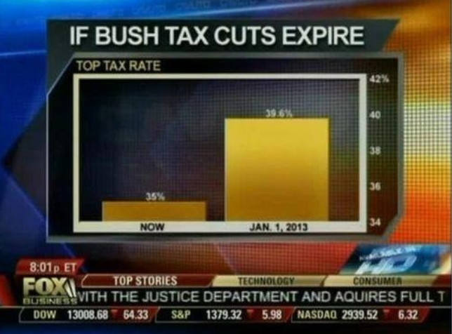 Issue: Visually, this chart shows the tax rate will quadruple or quintuple if the Bush tax cuts aren’t extended. If the axis started at zero however, the first bar would be about 90% the size of the second one.
How about this tweeted graph from shared by the National Review?
The only #climatechange chart you need to see. natl.re/wPKpro
(h/t @powerlineUS) https://t.co/QcrN2fCouT—
National Review (@NRO) December 14, 2015
Issue: The problem with this one is the axis does start with zero. The Huffington Post did a good cover of this graph here, along with what some other graphs would look like if you set the scale that large. Now of course there can be legitimate discussion over where a fair axis scale would be, but you should make sure the visual matches the numbers.
And one more example that combines two issues in one:

See those little gas pumps right there? They’ve got two issues going on. The first is a start date that had an unusually low gas price:

The infographic implies that Obama sent gas prices through the roof….but as we can see gas prices were actually bizarrely low the day he took office. Additionally, the gas pumps involved are deceptive:

If you look, they’re claiming to show that prices doubled. However, the actual size of the second one is four times the one of the first one. They doubled the height and the width:

While I used a lot of political examples here, this isn’t limited to politics. Andrew Gelman caught the CDC doing it here, and even he couldn’t figure out why they’d have mucked with the axis.
There’s lots of repositories for these, and Buzzfeed even did a listicle here if you want more. It’s fun stuff.
Why do we fall for this stuff?
Well, as we’ve said before, visual information can reinforce or skews your perceptions, and visual information with numbers can intensify that effect. This isn’t always a bad thing…after all nearly every scientific paper ever published includes charts and graphs. When you’re reading for fun though, it’s easy to let these things slip by. If you’re trying to process text, numbers, implications AND read the x and y axis and make sure the numbers are fairly portrayed, it can be a challenge.
So what can we do about it?
A few years ago, I asked a very smart colleague how he was able to read and understand so many research papers so quickly. He seemed to read and retain a ton of highly technical literature, while I always found my attention drifting and would miss things. His advice was simple: start with the graphs. See I would always try to read papers from start to finish, looking at graphs when they were cited. He suggested using the graphs to get a sense of the paper, then read the paper with an eye towards explaining the graphs. I still do this, even when I’m reading for fun. If there’s a graph, I look at it first when I know nothing, then read the article to see if my questions about it get answered. It’s easier to notice discrepancies this way. At the very least, it reminds you that the graph should be there to help you. Any evidence that it’s not should make you suspicious of the whole article and the author’s agenda.
So that wraps up our part on Pictures! In part 5, we’ll finally reach the text of the article.


